S&P 500 price returns during each presidential term since Truman ·
★ = term in progress ·
Democrat
Republican
Based on cumulative price returns, Clinton and Obama oversaw some of the strongest S&P 500 performance. However, annualised returns provide a fairer comparison by accounting for term length. This dashboard shows the full ranking for every president since Truman.
Historically, the S&P 500 has tended to perform well under both parties. The dashboard shows cumulative and annualised returns by party so you can compare directly. Keep in mind that many factors beyond the president affect markets, including the economic cycle inherited at the start of each term.
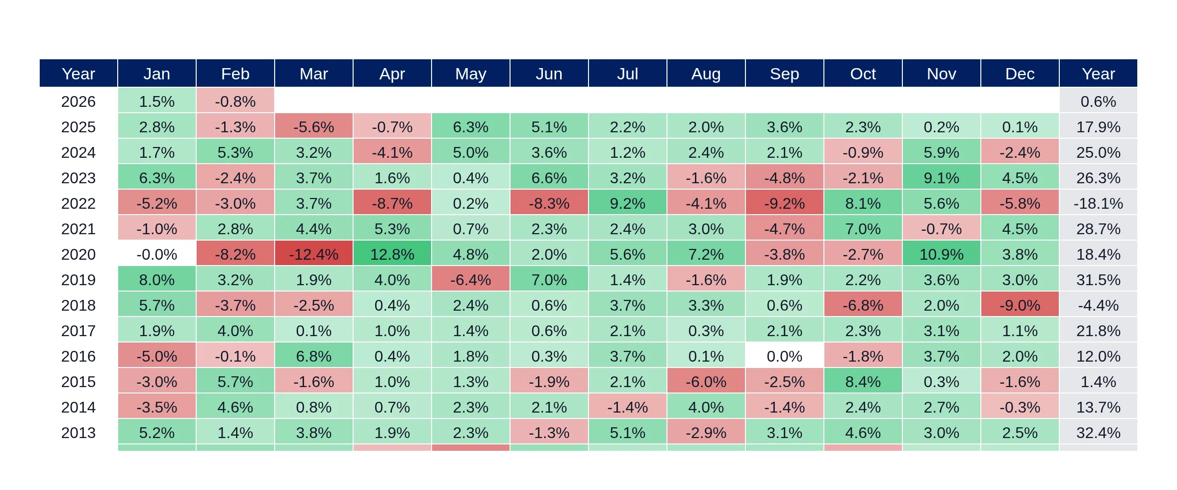
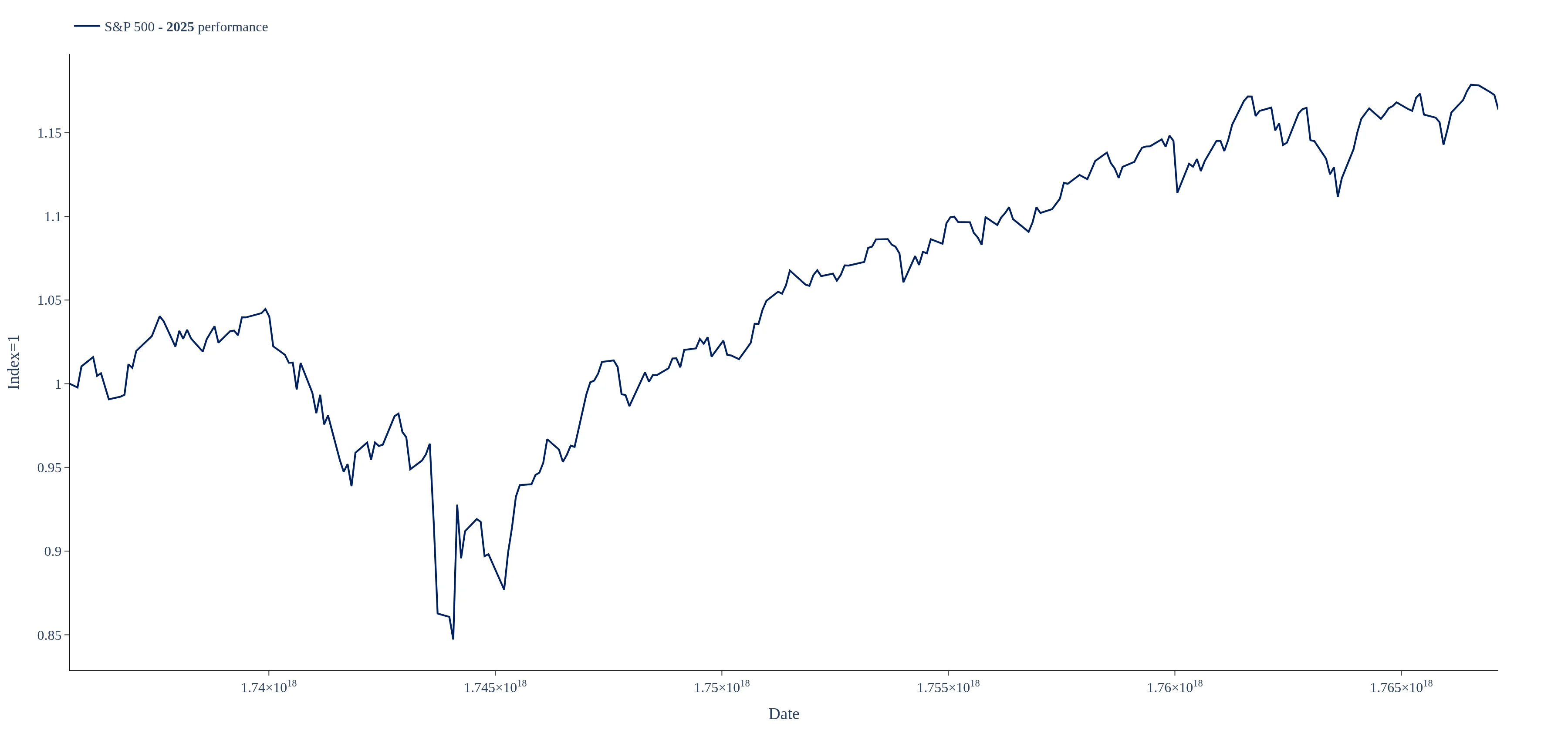
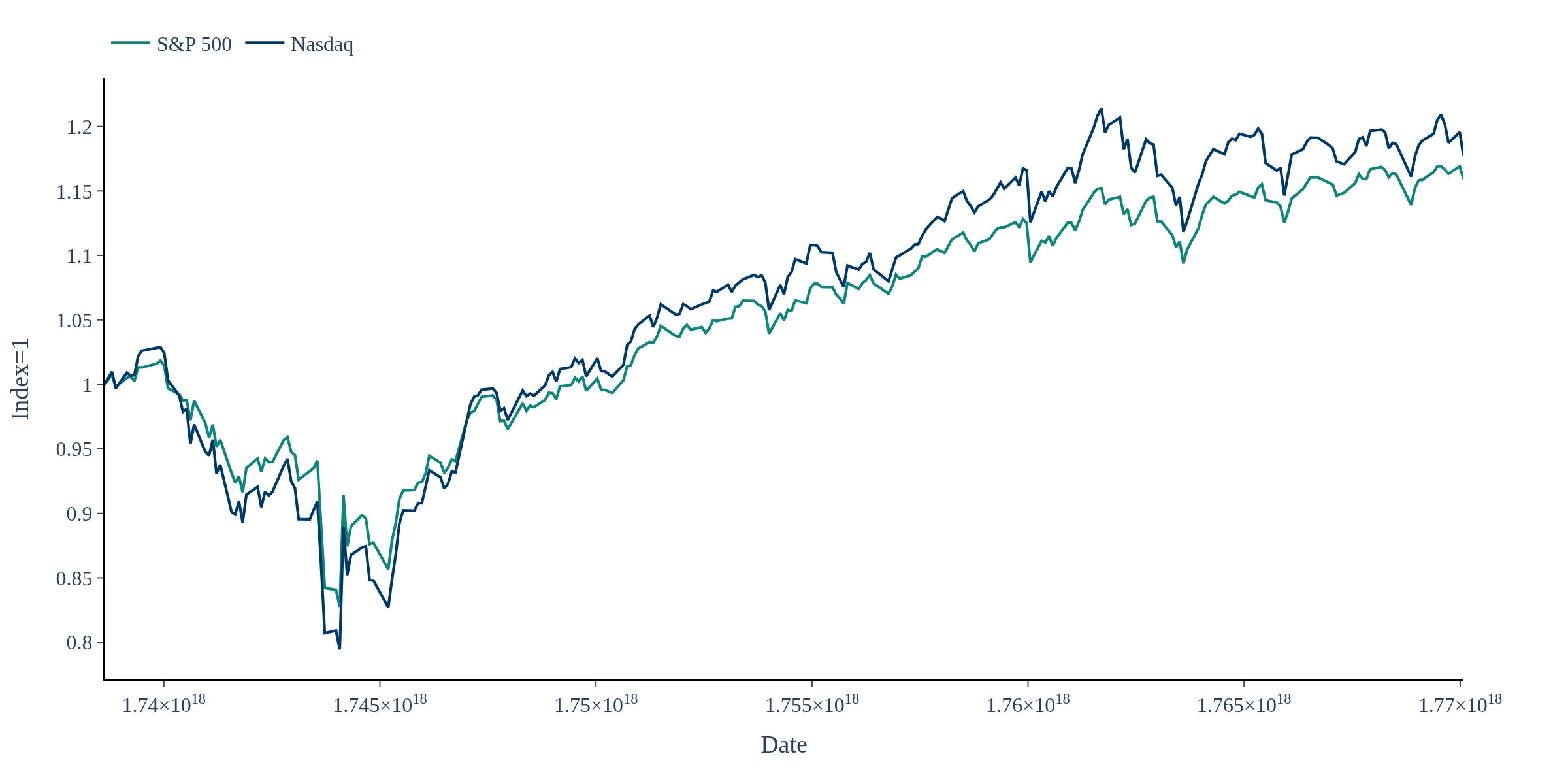
The returns shown are price returns only — they do not include dividends. This allows for a consistent historical comparison back to Truman using the full ^GSPC index history from Yahoo Finance.
The dashboard is updated regularly so the current president's term reflects the latest S&P 500 prices. The last update timestamp is shown at the top of the page.
This dashboard tracks S&P 500 price return performance across US presidential terms from Truman to the present. Returns are computed using daily closing prices of the S&P 500 index (^GSPC) sourced from Yahoo Finance. Note that these are price returns only and do not include dividend reinvestment. Cumulative return measures the total gain or loss from the first to the last trading day within each term. Annualised return normalises for term length, allowing fair comparison across presidents who served different durations. Maximum drawdown captures the largest peak-to-trough decline during the term. The current term is marked with ★ and reflects data to the most recent update.