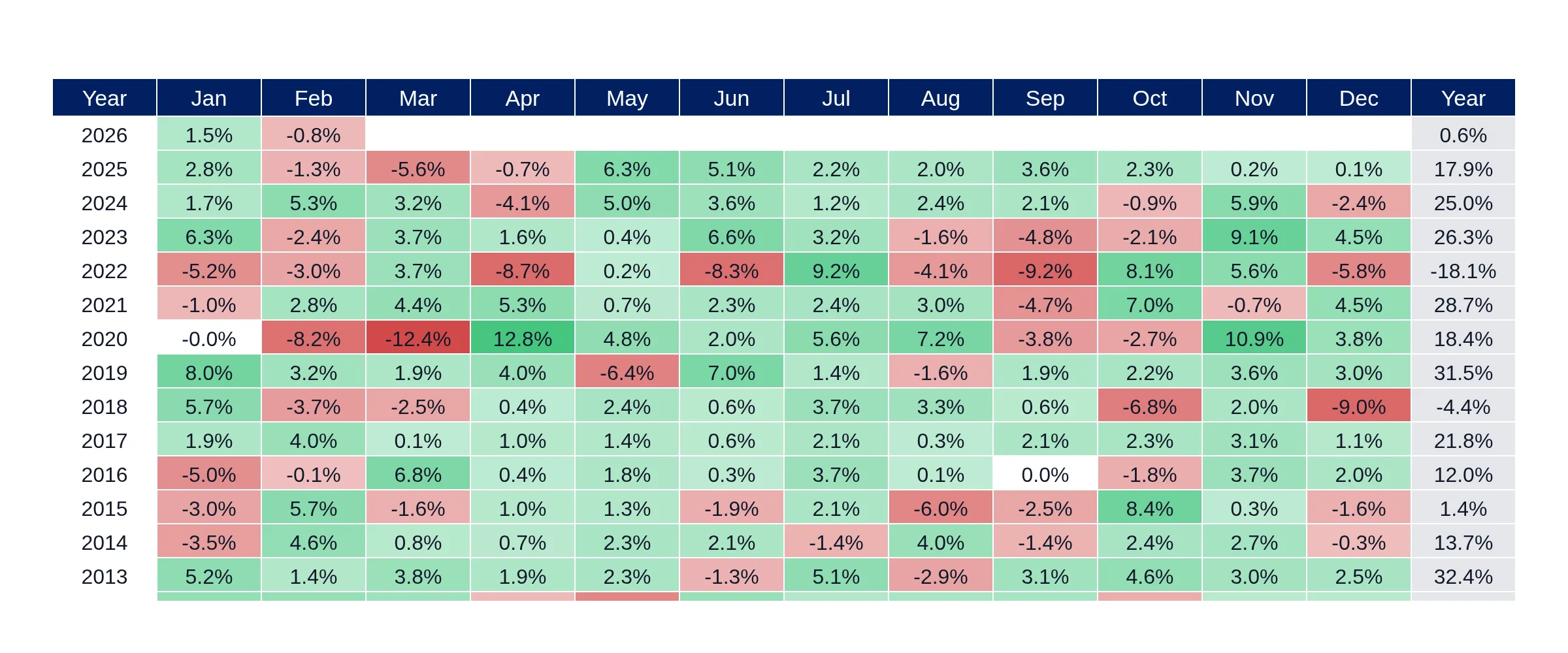
Interactive charts showing historical S&P 500 Equal Weight (RSP) annual and monthly returns. Data can be downloaded for further analysis.
You can analyze the historical performance of the S&P 500 Equal Weight Index (RSP) using our interactive dashboard, which displays annual returns as a bar chart and monthly returns in a heatmap format. This allows for easy comparison of equal-weighted versus cap-weighted S&P 500 performance over time.
The S&P 500 Equal Weight annual and monthly returns are calculated based on total returns sourced from market data providers and updated daily. The dashboard provides a clear visual representation of these returns, enabling users to identify trends and periods where market breadth influenced performance.
Yes, the S&P 500 Equal Weight Returns dashboard allows users to download historical return data for both annual and monthly periods. This feature facilitates further analysis and comparison of the RSP's performance against other indices or investment strategies.
This dashboard tracks the S&P 500 Equal Weight Index (RSP) total returns. Annual returns are shown as a bar chart for each calendar year, while monthly returns are presented in a heatmap format for granular analysis. Data is sourced from market data providers and updated daily. Use this dashboard to compare equal-weighted vs cap-weighted S&P 500 performance and identify periods where breadth drove returns.