Screen to observe the S&P 500 historical drawdowns.
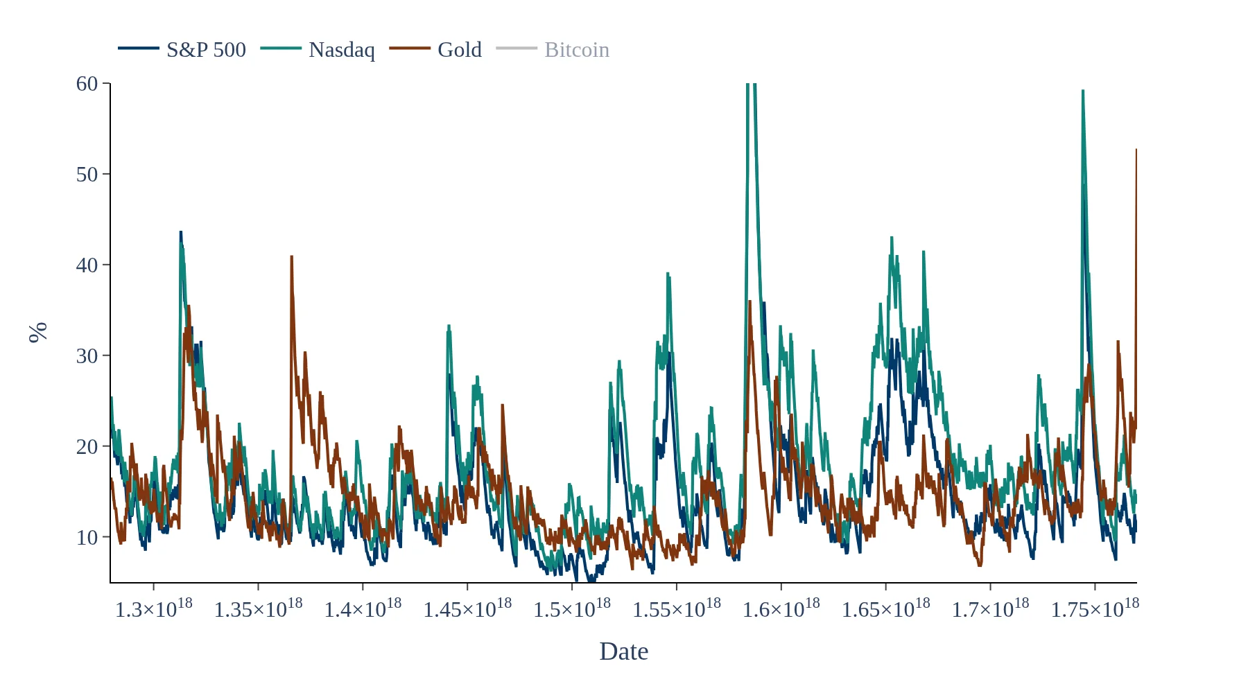
The S&P 500 drawdowns dashboard provides a visual representation of historical drawdowns, illustrating the percentage decline from the index's all-time high. This data helps investors assess downside risk and understand the depth and duration of market downturns, which is crucial for effective investment analysis.
This dashboard calculates S&P 500 drawdowns using daily closing prices to determine how far the index has fallen from its most recent peak. The results are updated each trading day and adjusted for corporate actions, allowing for an accurate assessment of historical corrections and bear markets.
The S&P 500 drawdowns plots highlight not only the depth of market declines but also the recovery periods following these downturns. By analyzing these trends, investors can better understand the historical performance of the index and make informed decisions regarding their investment strategies.
This dashboard calculates S&P 500 drawdowns using daily closing prices to show how far the index falls from its most recent peak over time. A drawdown is the percentage decline from the running all-time high to the current level, updated each trading day. The chart highlights the depth and duration of market downturns, helping compare corrections and bear markets across history. Price data is adjusted for corporate actions when available, and results are shown in nominal terms. Use this view to understand downside risk, recovery periods, and the path of “underwater” performance for the S&P 500.